1896-至今|奧林匹克運動會
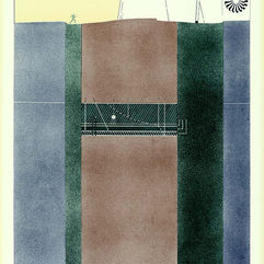
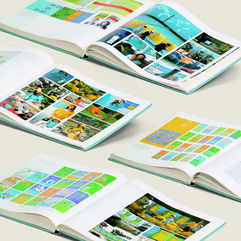
奧林匹克運動會的相關收藏為林磐聳老師的近年的重點收藏之一,林老師更受北京奧運主委會聘請擔任2008年北京奧運會徽徵選評選委員,實際以參與者的身分,深掘奧運設計的不同面相。第十一口內容含括各式奧運周邊紀念品、官方報告書、CI手冊��、門票、獎牌、授權商品、唱片等,台灣設計口更曾舉辦「美與力/歷屆奧運設計展」,展出眾多經典的奧運海報,透過這些豐富的史料,將奧運設計史上的精采篇章再現於觀眾眼前。
1896-現在|オリンピック
オリンピックに関するコレクションは、近年における林磐聳名誉教授の重要なコレクションの1つです。林磐聳名誉教授は国際オリンピック委員会からの招聘を受け2008年北京オリンピックのマスコット選考委員を担当し、実際に参加者として深くオリンピックにおけるデザインの異なる面を掘り下げています。11番目の入口には、様々なオリンピックの周辺記念品、公式報告書、CIマニュアル、チケット、メダル、授権商品、レコードなどが含まれています。Taiwan Design Cornerでは「美と力/歴代オリンピックデザイン展」を開催し、多くの代表的なオリンピックのポスターを展示しました。豊富な史料により、オリンピックのデザイン史への素晴らしい貢献が人々の目の前で再現されています。
1896-Present|Olympic Games
The related collection of the Olympic Games is one of Mr. Lin Pan-song’s key collections in recent years. Mr. Lin was also hired by The International Olympic Committee to serve as a selection committee member for the 2008 Beijing Olympic Emblem. As a participant, he delved into the different perspectives of Olympic design. Showcase XI includes a variety of Olympic souvenirs, official reports, CI manuals, tickets, medals, authorized products, and discs. Taiwan Design Corner also held “Beauty and Power: Previous Olympic Design Exhibition,” showcasing numerous classic Olympic posters and presenting the splendid chapters of Olympic design history to visitors through these abundant historical materials.
1896 雅典奧運
Athens Olympic Games
1894年顧拜旦在巴黎國際會議中提出復興奧林匹克運動會,爾後會議通過,並由奧運發源地雅典重新主辦第一屆現代奧運。台灣設計口典藏當時法國報導雅典奧運畫報、郵票、火柴盒等,別具時代意義。
In 1894, Charles Pierre de Frédy, Baron de Coubertin proposed the revival of the Olympic Games at the International Conference in Paris, which was later approved, and Athens, the birthplace of the Olympic Games, re-hosted the first modern Olympic Games. The Taiwan Design Corner has a collection of Athens Olympic paintings, stamps, and matchboxes from France at that time, which are of particular significance to the times.
1928 阿姆斯特丹奧運
Amsterdan Olympic Games
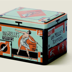
本次奧運會首次在奧運期間點燃了聖火,為往後的聖火接力奠下基礎。主視覺海報可見運動員在藍色基底上,以充滿動感的姿態傳遞奧運精神。由Chris van der Hoef 所設計的每日運動手冊封面也是本次平面設計的亮點之一。
This was the first time that the Flame was lit during the Olympic Games, laying the groundwork for the flame relay that would follow. The main visual poster shows the athletes on a blue background, dynamically conveying the Olympic spirit. The cover of the daily program booklet designed by Chris van der Hoef is also one of the graphic design highlights.
1936 柏林奧運
Berlin Olympic Games
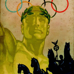
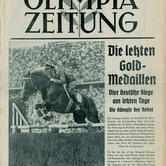
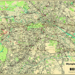
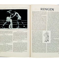
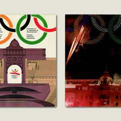
柏林奧運會徽是由德國帝國之鷹及奧運五環花紋所組成的銅鐘,主視覺海報則是由 Franz Würbel 所設計。本屆由納粹德國政府舉辦奧運會曾受多國的抵制,其所留下的文獻可視為呈現此段歷史的重要史料。臺灣設計口典藏本屆奧運官方報告書、每日運動手冊、摺頁地圖、雜誌報導等。
The emblem of this Olympic Games is a bronze bell containing the five Olympic rings with a superimposed Reichsadler (German imperial eagle), and the main visual poster designed by Franz Würbel. The Olympic Games held by the Nazi German government were boycotted by many countries, and the documents left behind can be regarded as necessary historical materials for the presentation of this history. The official report of this year’s Olympic Games, daily program booklet, fold-out maps, magazine reports, etc., is in the Taiwan Design Corner collection.
1948 倫敦奧運
London Olympic Games
因第二次世界大戰停辦十二年的奧運會再次於倫敦舉行,並首次以電視轉播。會徽與海報皆由五環和西敏宮組成,大笨鐘的指針指向4 點鐘方向是本屆奧運會計劃開幕的時間,極具英國特色,主視覺海報由 Walter Herz 所設計。
After suspension for twelve years due to the Second World War, the Olympic Games were held in London again and were televised for the first time. The emblem and the poster are composed of the five rings, Palace of Westminster, and the Big Ben’s clock-face is set at 4 p.m. - the time of the official Opening Ceremony, which was “very British.” The primary visual poster is designed by Walter Herz.
1952 赫爾辛基
Helsini Olympic Games
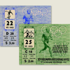
本屆海報採用Ilmari Sysimetsä 於1940 年奧運會中設計的海報圖案,並在原海報設計基礎上更新了日期和國家名稱,畫面中的跑者展現出健美與活力。會徽則是結合了奧運五環與奧運塔樓進行設計。
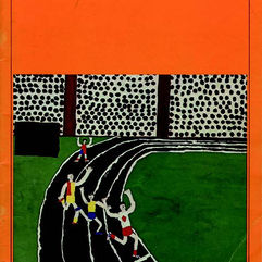
This year’s Olympic poster is based on the poster pattern designed by Ilmari Sysimetsä in the 1940 Olympic Games, with updated dates and country names, and the runners in the picture show their fitness and vitality. The logo combines the five Olympic rings and the Olympic tower.
1960 羅馬奧運
Rome Olympic Games
相傳羅馬城是由母狼所養育的一對雙胞胎兄弟 Romulus 及 Remus 創建而成,設計師Armando Testa 便以此傳說設計了本屆奧運 會的會徽。在運動手冊中則可見以馬賽克拼貼概念設計而成的運動圖標,呈現主辦國的文化與傳統工藝。
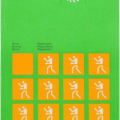
According to legend, the city of Rome was founded by twin brothers Romulus and Remus, whom a wolf mother raised. The designer Armando Testa designed the emblem for the Olympic Games based on this legend. In the program booklet, a mosaic collage concept is used to design the sports icons, reflecting the culture and traditional craftsmanship of the host country.
1964 東京奧運
Tokyo Olympic Games
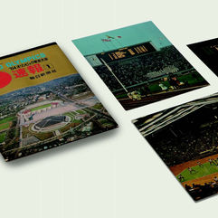
東京為亞洲國家首次舉辦的奧運的城市,本屆奧運設計的文獻資料也是台灣設計口的重點收藏之一。整體規劃由勝見勝統籌,主視覺海報由龜倉雄策所設計,原弘、河野鷹思、田中一光、永井一正等著名設計師也參與了門票、運動手冊、圖標等文宣品的設計。
Tokyo was the first city in Asia to host the Olympic Games, and this year’s Olympic design documentation is one of the highlights of The Taiwan Design Corner’s collection. Masaru Katsumi coordinated the overall planning. Yusaku Kamekura designed the main visual poster, and famous designers such as Hiromu Hara, Takashi Kono, Ikko Tanaka, and Kazumasa Nagai also designed the tickets program booklet, icons, etc.
1968 墨西哥奧運
Mexico Olympic Games
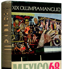
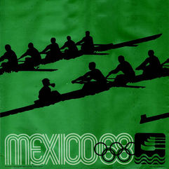
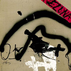
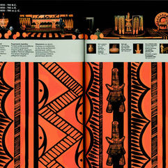
墨西哥奧運會徽是由 Lance Wyman、Eduardo Terrazas、Eduardo Terrazas 共同設計,將「MEXICO」、「奧運五環標誌」、「68」與當地傳統壁畫圖形巧妙地融為一體,爾後以此會徽製作了本屆奧運主視覺海報,此設計反映出歐普藝術對於奧運設計的影響。
This year’s game emblem was designed in collaboration with Lance Wyman, Eduardo Terrazas, and Eduardo Terrazas. The emblem combines “MEXICO,” “Olympic five rings,” “68”, and traditional Mexico’s local mural graphics, and was then used to create the primary visual poster of the Olympic Games, which reflects the influence of Op Art on the design of the Olympic Games.
1972 札幌冬季奧運
Sapporo Winter Olympic Games
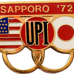
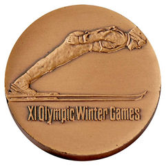
本屆奧運整體規劃由勝見勝統籌,廣招日本著名設計師參與。會徽是由永井一正所設計,河野鷹思、龜倉雄策、細谷嚴等人操刀海報設計,聖火的設計由柳宗理負責,福田繁雄負責服務設施標章設計。
The overall planning of this year’s Olympics was coordinated by Katsuya Katsumi, with the participation of famous Japanese designers. Kazumasa Nagai designed the emblem, the posters were designed by Takashi Kono, Yusaku Kamekura, Gan Hosoya; Sori Yanagi designed the Flame; and Shigeo Fukuda designed the service facility logo.
1972 慕尼黑奧運
Munich Olympic Games
本屆奧運會以官方、運動、文化活動為主題製作一系列海報,旨在推廣慕尼黑奧運的整體精神。奧運設計總監 Otl Aicher 大量應用網格系統進行設計,讓平面設計發揮出統一視覺美感的最大功能性。奧運史上第一隻官方吉祥物「Waldi」也在慕尼黑奧運中首次亮相。
This year’s Olympic Games featured a series of posters on official, sporting, and cultural events to promote the overall spirit of the Munich Olympics. Olympic design director Otl Aicher made extensive use of the grid system to maximize the functionality of the graphic design for a unified visual aesthetic. “Waldi,” the first official mascot in Olympic history, made his debut at the Munich Olympics.
1976 蒙特婁奧運
Montreal Olympic Games
本次會徽是頒獎台意象與蒙特婁(Montreal)首位字母「M」的結合。名為「邀請函」的官方海報是由 Rolf Harder 所設計,畫面中 疊加連續的波浪狀象徵邀請各大洲運動員參與的聲音以及收到的回響。本專輯收錄由 C. Malenfant 所設計的奧運聖火女神海報
The emblem for this year’s Olympic was a combination of podium imagery and the first letter “M” of Montreal. The “The Invitation” official poster was designed by Rolf Harder and featured a continuous wave pattern overlaid on the image to symbolize the sound of the invitation to athletes from all continents and the response received. This album includes a poster of the Olympic Goddess of Fire designed by C. Malenfant.
1980 莫斯科奧運
Moscow Olympic Games
Vladimir Arsentyev 根據莫斯科城市建築特色設計本屆奧運會徽,五環旗上可見五條呈金字塔狀平行排列的線條,頂部五角星以及紅色則象徵前蘇聯國旗。由著名兒童插畫家Victor Chizhikov 創作的本屆吉祥物「Misha」受到許多關注與喜愛。
Vladimir Arsentyev designed the Olympic Games emblem based on the architectural features of the city of Moscow. The five-ringed flag features five parallel lines in the shape of a pyramid, and the five-pointed star and red color at the top symbolize the former flag of the Soviet Union. The mascot “Misha,” created by the famous children’s illustrator Victor Chizhikov, has received much attention and popularity.
1984 洛杉磯奧運
Los Angeles Olympic Games
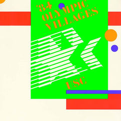
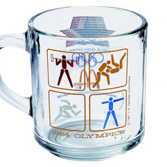
繼 1932 年後洛杉磯第二次舉辦奧運會。星星代表著人類最高期望的符號,本屆會徽即以紅白藍三色星作為設計的元素,橫條紋則是 代表了參賽者追求卓越的過程中所展現的速度。主視覺海報則是由 Robert Rauschenberg 所設計,吉祥物「Sam」則是由出自迪士尼公司藝術家 Moore 之手。
The emblem for this year’s game is designed with red, white, and blue stars; the stars represent the symbol of the highest human expectations, and the horizontal stripes represent the participants’ speed in their pursuit of excellence. Robert Rauschenberg designed the main visual poster, and Moore, a Disney artist, designed the mascot “Sam.”
1988 漢城奧運
Seoul Olympic Games
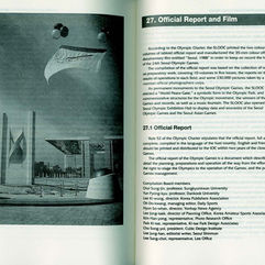
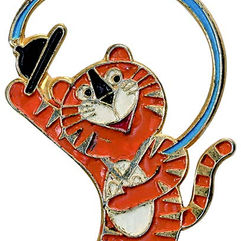
漢城奧運會徽以朝鮮太極圖的概念作為基礎,由梁承椿所設計。 官方海報是由電腦繪製而成,畫面中央為舉著奧運火炬的運動員,象 徵著人類正向幸福和繁榮邁進,本屆尚有 27 款運動項目海報用以推廣大眾對奧運的認知。台灣設計口收錄本屆奧運吉祥物設計師金炫所捐贈的多件藏品。
In this year’s games, the emblem is based on the concept of the Korean Samtaegeuk pattern and was designed by Yang Sung-Chun. Young- Jae Cho was responsible for the official poster, the first-ever computergenerated poster for the Olympic Games, which features an athlete holding the Olympic torch in the center of the image, symbolizing humanity’s march toward happiness and prosperity. Twenty-seven sports posters are also available to promote public awareness of the Olympic Games. The Taiwan Design Corner features several items donated by Kim Hyun, this year’s Olympic mascot designer.
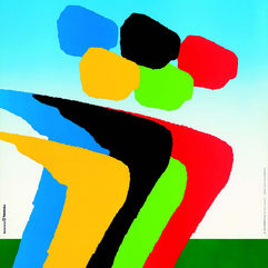
Josep Maria Trias 負責巴塞隆那奧運會徽的設計,以紅、藍、黃三色組成充滿活力和律動的人形作為主視覺。本屆奧運設計了四組不同的海報,包括奧運會官方海報、畫家版海報、設計師海報和運動攝影海報。西班牙漫畫家 Javier Mariscal 設計的吉祥物「Cobi」也是本 屆的看點之一。
Josep Maria Trias was responsible for designing this year’s Olympic Games emblem, using the red, blue, and yellow colors to form a vibrant and dynamic human figure as the main visual. Several posters were designed for this Olympic Games, including official posters, art posters, designer posters, and sports photography posters. The mascot “Cobi” designed by Spanish cartoonist Javier Mariscal, was also the visual focus of this year’s event.
1996 亞特蘭大奧運
Atlanta Olympic Games
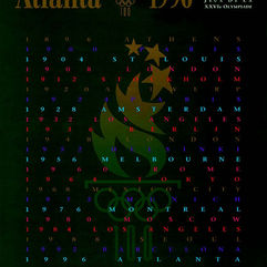
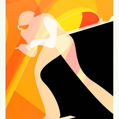
本屆奧運適逢奧運百年紀念,設計的會徽可見漸變成完美星形的火炬以及由五環和數字 100 組成類似古典希臘石柱的底座,官方海報 則選擇了 Primo Angeli 設計的作品,運動員的剪影與會徽上的火焰巧妙地融合。林磐聳教授曾親赴此屆奧運考察並撰文。
This year’s Olympic Games coincided with the centennial of the Olympic Games, and Landor Associates was responsible for the overall planning and design of the emblem. The emblem can be seen in the torch, which gradually becomes a perfect star, the Olympic rings, and the 100th anniversary of the Olympic Games, forming a base similar to a Doric column. The official poster was designed by Primo Angeli, with the silhouette of the athletes blending with the flame on the emblem. The Olympic’s auxiliary graphics use a patchwork pattern to symbolize the integration of multiple races.
1998 長野冬季奧運
Nagano Winter Olympic Games
本屆會徽與吉祥物均由 Landor Associates 負責總體規劃設計,將六位具有動感的運動員組成六辦雪花的圖像;四隻貓頭鷹吉祥物分別代表:分別代表火(Sukki/ 寸喜)/ 空氣(Nokki/ 能城)/ 土(Lekki/ 家喜)和水(Tsukki/ 都木),組成「Snow lets together:因雪花而讓大家相聚」。台灣設計口典藏本屆奧運會 CI 手冊及吉祥物所開發的周邊商品。
The logo and mascots were designed by Landor Associates, with six dynamic athletes forming the image of six snowflakes; and four owls representing fire (Sukki), air (Nokki), earth (Lekki), and water (Tsukki), forming the “Snow lets together.” The Taiwan Design Corner has a collection of products developed for the Olympic Games CI Manual and mascots.
2000 雪梨奧運
Sydney Olympic Games
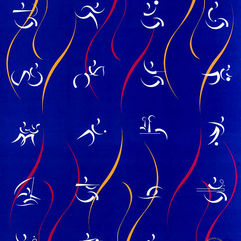
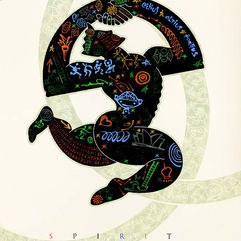
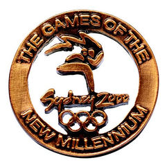
FHA image design 將回旋鏢、太陽、岩石的圖樣搭配港灣的藍色、沙灘的金色以及內陸的紅色,創作出飛奔的千禧年運動員形象。 本屆奧運會 Matthew Hatton 以澳洲獨特物種做為吉祥物靈感,分別為:笑翠鳥「Olly」、鴨嘴獸「Syd」和針鼴「Millie」。
Richard Henderson created the figure symbolizes the speed and agility of a “Millennium Man” athlete, moving towards the new millennium by symbolizing the sea in Sydney Harbour (blue), the sun of Australia (yellow), and its earth (red). In this year’s Olympic Games, Matthew Hatton used unique Australian species as inspiration for the mascots: Millie the echidna, Syd the platypus, and Olly the kookaburra.
2004 雅典奧運
Athens Olympic Games
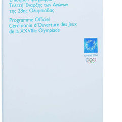
作為奧運發源地與現代奧運首屆舉辦城市,本屆設計大量採用古希臘的文化元素,會徽是由橄欖枝製成的桂冠並採用代表著希臘風景 的白、藍色調。吉祥物 Phevos 和 Athena 的原型取自古希臘紅土陶偶, 運動海報的象形圖案靈感則是來自基克拉澤斯文明的大理石人像。
As the birthplace of the Olympic Games and the city where the modern Olympic Games were first held, the design of this year’s Games was heavily inspired by ancient Greek cultural elements, with the emblem being a Kotinos (olive wreath) and the white and blue tones representing the Greek landscape. The mascots Phevos and Athena were based on ancient Greek terracotta dolls, and the pictogram of the sports poster is inspired by the marble statues of the Greek civilization.
2006 杜林冬季奧運
Torino Winter Olympic Games
由 Studio Benincasa-Husmann 負責的會徽以杜林重要文化中心「安托內利尖塔」的倒影圖案作為主設計。主視覺海報由都靈組委會(TOROC)設計製作,同樣採尖塔作為設計元素,此外組委會還發行了一組十六張的運動海報。
The logo by Studio Benincasa-Husmann features the reflection of the Mole Antonelliana, an important cultural center in Turin. The main visual poster was designed by the Turin Organizing Committee (TOROC), using the spire as a design element, and a set of 16 campaign posters were also released. Posters and the organizing committee also released a set of 16 sports posters.
2008 北京奧運
Beijing Olympic Games
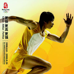
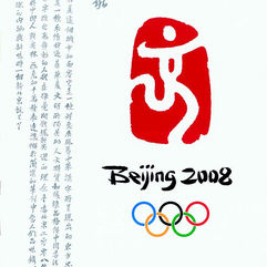
會徽由張武、郭春甯、毛誠設計,巧妙地將「京」字以中國篆刻的形式呈現,並融合躍動的人像。主視覺海報則由清華大學美術學院教授何潔帶領的團隊設計,其餘尚有多張文化海報與運動海報在本屆奧運會中亮相,展現出中國傳統文化特色。
The emblem was designed by Zhang Wu, Guo Channing, and Mao Cheng, which cleverly presents the Chinese character “ 京 (Jing)” in a traditional Chinese seal carving and incorporates a leaping human figure. The main visual poster was designed by a team led by Professor He Jie from the Academy of Arts & Design, Tsinghua University. In contrast, several other cultural and sports posters were presented at the Olympic Games, showing the traditional Chinese cultural characteristics.
2012 倫敦奧運
London Olympic Games
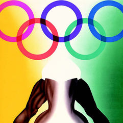
本屆會徽由Wolff Olins 所設計,構圖中少見地未強調主辦城市與國家名稱,本年度的殘奧會也首次運用了相同的會徽。主視覺海報 「LOndOn 2012」 是由 Rachel Whiteread 設計,展現出奧運五環顏色相互疊加的效果。吉祥物則是金屬造型的 Wenlock 脫穎而出。
This year’s emblem was designed by Wolff Olins, with an unusual composition that does not emphasize the name of the host city and country, and the same emblem was used for the first time in this year’s Paralympic Games. The main visual poster, “London 2012,” was designed by Rachel Whiteread, showing the effect of the five Olympic rings overlapping each other. The mascot is the metal-shaped Wenlock, which outstands from the rest.
2020 東京奧運
Tokyo Olympic Games
本屆奧運會因 Covid-19 疫情延至 2021 年夏季舉行。會徽是由野老朝雄設計所設計,圖案採用日本傳統色彩靛藍色與在江戶時代被稱為「市松模樣」方格圖紋所組成,傳達文化的優雅與精緻。此外,為了傳達永續社會的理念,本次奧運會的獎牌、火炬、展台多採用可回收廢棄物作為材料進行創作。
The Olympic Games were postponed to the summer of 2021 due to the Covid-19 pandemic. The emblem was designed by Asao Nogoro, using a chequered pattern known as “Ichimatsu Moyo” from the Edo period, with the three varieties of rectangular shapes and the traditional Japanese color indigo blue, conveying the elegance and sophistication of Japanese culture.


